 In my musings before, during, and after the Tour Championship, I came across some more fodder on our favorite topic: driving distance and how equipment is ruining the game. Readers of this site know where I and most here at The Sand Trap stand on this, so I won’t rehash.
The question remains, how do I prove it? How do I prove that it isn’t all about distance? I’ve beaten it into you about Greens in Regulation like a dead horse. Well, the answer is in a formula… something that over time can be tried and trued… something a bit more tangible than “I’m right and you’re wrong.” The difficult thing about formulas is creating one that is just that: right.
Distance is everything
One of the first steps in formulation is trial and error. So let’s assume the above statement that others involved in the game believe is true… that distance is everything and is killing the game. Assuming this to be true, results would very closely follow driving distance averages week to week. We could predict with near 100% certainty who would win: every week, the longest driver would come out on top. Simple enough.
For the basis of this discussion, I’ll use last week’s Tour Championship. I pulled the data together for each player and where they finished the tournament in Driving Distance (DD), Greens in Regulation (GIR), Putting Average (PA), Driving Accuracy (DA) and Total Putts (TP). The below graph is the plotline of how DD fared against finishing position.
Unlike last week, where we looked at the top 30 golfer’s statistics entering the tournament, this week’s numbers are restricted solely to the performance of those 29 golfers in the Tour Championship.
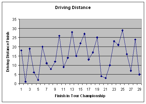
I almost get dizzy looking at this graph. Up, down, up, down… I feel like that little bobble-head chihuahua dog. Yo quiero Taco Bell! The distribution of points is all over the place. The points trend subtly upwards at first, implying that high finishers (on the left) should be longer drivers (low on the graph), so low-left to high-right makes sense there. Unfortunately, once you get past 14th or 15th place, the plot trends back down and scatters even more.
This is not a good sign of predictability or consistency. The five longest drivers in the Tour Championship finished anywhere from second place to dead last. The winner by six shots, Bart Bryant’s worst finish in the stats tracked was in driving distance: he finished 18th out of 29. He was first in greens in regulation, first in driving accuracy, and third in putting average. Bart didn’t win by crushing it off the tee… he won it getting it on the green and in the hole.
Tiger? Sure he was first in driving distance (DD), but he was also first in putting average (PA), averaging only 1.596 putts per GIR. Think about that. He made nearly half of the birdie putts he looked at. Some may say that was because he was hitting it so close with wedges into the green, but why then didn’t he hit the most greens? He was 19th in GIR. In fact, Tiger hit the most greens (round one) when he averaged his shortest distance off the tee for the week.
Formulating Perfection
“Perfection is unattainable.” – Roy McAvoy, Tin Cup
How true. I’m not going to say that there is a perfect formula out there for predicting finishes on tour. Looking solely upon DD is silly though. DD is not everything, but it is part of the equation. Looking at past research, we do know where it stands and hopefully how much weight it should carry. The stats in order of importance go like this:
GIR
Putting *
Driving Distance
Driving Accuracy
Now you’ll notice the little * next to putting. That is because in the past I’ve exclusively used Putting Average. Well, I’ve looked a bit more into combining it with Total Putts (TP) to get a composite putting ranking. The reason is that TP gives you a factor of short game that PA does not. Players with a low GIR percent can offset that by having a low number in TP. So for this experiment and ones going forward, Putting will be the combined ranking of a player in TP and PA.
OK. So we know the order of importance, but what about the weight. I looked back through my notes and the best-fit graphs in previous columns. It seemed that the order above trended in a linear, even fashion. So with that in mind, I came up with this:
GIR – 40%
Putting – 30 %
DD – 20%
DA – 10%
I call it the 40-30-20-10 rule. I know, a bit long, but it has a nice ring to it. I applied this rule (formula) to the Tour Championship results to see if it was closer to predictability. Below is formula and the result:
Rating = (0.4 * GIR) + (0.15 * PA) + (0.15 * TP) + (0.2 * DD) + (0.1 * DA)
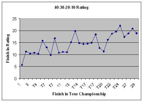
This looks a lot better. The trend line continues upward throughout the entire graph and the grouping is much closer. I don’t even need a best-fit line: it’s pretty obvious where that line would be drawn.
The variations in this graph – those points above and below the line (there will always be some anomalies) are easily explained. First example is Retief Goosen. He was in the bottom third of all categories except for the two putting stats. Putting can be a great equalizer when other parts of your game go wrong. Second was Ben Crane. He was 28th (next to last) in GIR. This alone should have killed him, but he was first in TP. He had only 24 putts in each of his first two rounds. Ben was getting up and down like a fiend. The polar opposite of these two players was Kenny Perry. Kenny was second in GIR and fourth in DD. Hitting the ball that well I would have thought he would have had a better tournament, but Kenny was 27th in PA and 29th in TP. Unfortunately putting often is on the wrong side of being the equalizer.
The Next Step…
Is this perfect? Will anything be 100% accurate in correlating different skills/statistics with results? No, but I’m not looking for perfect. I’m looking to find what it is that drives results for players on the PGA Tour. That’s the point to a lot of number crunching… we want to find the answer before it is given. In doing this I keep an open mind to what will drive those answers and let the data speak for itself… and it has a lot to say.
If you’d like to download the Excel document used to create these stats (so you can have a look for yourself), pop into our forum and download it. When next year begins, we’ll see how this approach fares on a full field.
P.S. Big thanks to Editor-in-Chief Erik J. Barzeski for prompting me to do this and providing some guidance on what ratios might work.
I’d switch the DD’s 20% with DA10%. I think accuracy proved in the past to be more important (except for Vijay’s freaky run). Other than that – great analysis Dave. I wish I was paying more attention in my math class 😉