 I’ve ignored the women too long. Sorry, its just a habit us men have. So far nearly all of my research has been based on the PGA Tour. This week, I’m going to look at the LPGA Tour and see if I come to the same conclusions.
Some of the first research found that Greens in Regulation (GIR) correlated closest to scoring followed by Putting (PA), Driving Distance (DD) and then Driving Accuracy (DA). Will it be the same for the ladies? Read on to find out. And, of course, check the “Numbers Game” archives for the original articles on these trends and numbers.
Driving Accuracy (DA)
The least relevant stat remains the least relevant… at least it is tied for that in the LPGA realm:
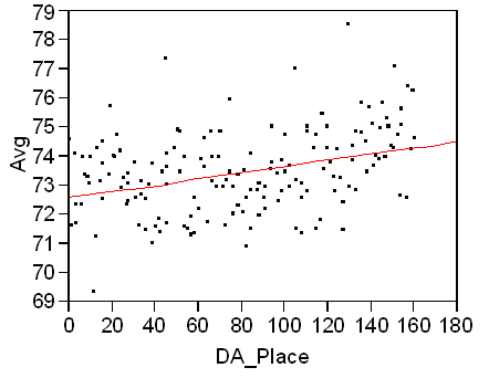
Being more accurate off the tee still helps though. As you can see the fit line slopes down and to the left meaning scoring drops as players are more accurate off the tee. Of course the points are scattered pretty well. Also, I notice a small curve up (in scoring average) in the cluster of points from 0-20. Even though the slope is down and to the left, that end turns up. So I did this:
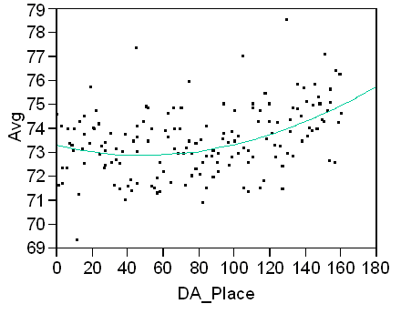
This is a curved polynomial fit. It shows, as I suggested, that as the DA place creeps below 40, the scoring average trends back up slightly.
Driving Distance (DD)
Driving distance has a nearly identical best-fit line as DA:
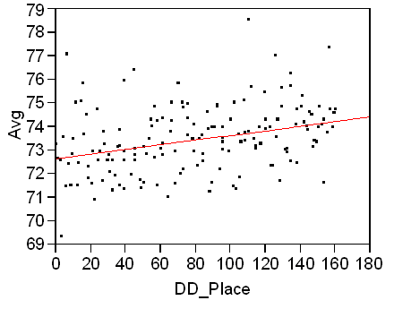
The only difference here is that there is not a turn back up at the left of the graph like there was in DA. I applied a curved polynomial and it pretty much hugged the best-fit line, so for the sake of length, I didn’t include it and you’ll just have to trust me. So far it is interesting that the ladies have been very similar to the men. I expected to see something different… I wasn’t sure what, but something different.
Putting Average (PA)
Aha! Something different. What you say? Take a look:
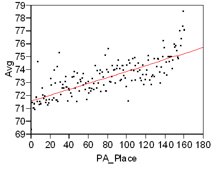
None of the men’s charts ever looked this tight. The distribution of points (or lack of distribution if you will) is the best I’ve seen yet. I don’t think that you even need the red best-fit line to see how PA correlates with scoring on the LPGA Tour. If you took the line out of DA or DD it would be hard to estimate where it would go. This is solid.
Greens in Regulation (GIR)
So, does GIR correlate better like the PGA Tour? Take a look:
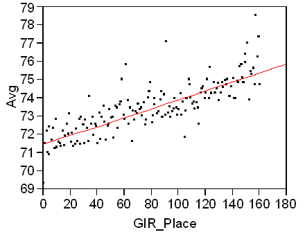
I was shocked. Seeing the PA graph was cool, but I never expected the GIR graph to be nearly identical… and yes, the slope of the line is slightly better than PA. Not by much. You could call it a virtual tie, but I give the nod to GIR only because the distribution of points looks a bit tighter.
40-30-20-10
I had to apply my 40-30-20-10 rule. For first-time readers, look here and you’ll see what I’m talking about. It just means that scoring results are can roughly be attributed by factoring in 40% GIR, 30% Putting, 20% DD, and 10% DA. Since this formula worked so well for PGA Tour players, I wanted to see if my rule worked as well or even better for the LPGA Tour.
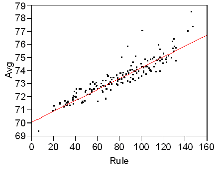
It fits even better than the PGA Tour. I thought that it might after looking at the two previous graphs, but we can almost start calling the 40-30-20-10 rule more of a law.
Conclusion
So what does this mean for the ladies? Hit a lot of greens and putt it well. DA doesn’t correlate much to scoring and DD isn’t that much more meaningful. Here we are again showing that it is about greens and putting. Remember that the next time you are practicing.
Dave: Great work on the numbers. Guess we all need to work on our putting and iron play.
Have you looked at the 40-30-20-10 rule and how it fits only with major championships? I wonder if driving accuracy becomes more important on those course setups.
I applied it to the Tour Championship last year in my first article about it.
http://thesandtrap.com/the_numbers_game/formulating_a_formula.php
It’s hard to collect the data for a tournament because they only post rankings in those stats in the individual player’s bio…not like the regular stats page the PGA Tour provides. It makes compiling stats by tournament a nighmare. Even doing the Tour Championship for 30+ players was tedious and time consuming. I’m going to try and do my best though.
It would be great to see these overlayed with the stuff from the PGA Tour and perhaps even the Nationwide Tour (or maybe add in the Nationwide vs. the PGA). I would love to see how well the different tours and sexes stack up against another.