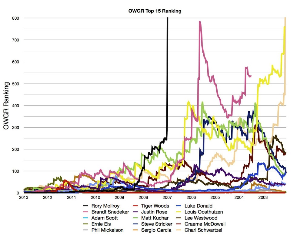
 A few months ago, back when Tiger was chasing down the number one ranking, I got an idea: Why not graph out the trajectories of the world’s top players over their careers, using the official data available on the Official Golf World Rankings website? At the time, the OWGR site only provided downloadable player data back until about 2003, which is fine for the careers of Rory McIlroy and Brand Snedeker, but, as you’ll see below, the Phil Mickelson graph from 2003 on is relatively boring.
Thankfully, when I looked at the data again this month, they had expanded the data all the way back to their career beginnings. Ernie Els, for instance, the oldest player I tracked, has data going back to 1989.
So this is what I decided to do: I got the points tally and OWGR ranking data for the top 15 players in the world as of July 7th (a while ago, I know, but it takes a while to compile and graph all of the data), and graphed both sets. The OWGR points and rankings are through that same day, so they do not include Phil Mickelson’s Scottish Open win or his British Open title. Tiger’s Bridgestone win is similarly unrepresented.
I decided to normalize the y-axes with a maximum of 25 points and a 500 ranking for comparison’s sake, though with some of the more consistent golfers (Tiger, Phil, Ernie for much of the mid-2000s) that is a bit to their detriment (in that you can’t see the more slight variations). The x-axes are different for each player, going back to the very beginnings of their pro careers. The OWGR data can get a bit wonky at the very beginnings of the data, which you can see pretty easily in the Tiger and Rory graphs. The y-axes cutoffs do minimize that a bit.
At the beginning I’ve also created two graphs, which superimpose data for all 15 players dating back to 2003.
If graphs aren’t your thing, well, read the captions and enjoy the colors. And if you have to use Excel all day at your job, fear not, for I used the Apple app, Numbers.


Continue reading “Graphing the World Rankings”
Share this with your golf buddies:
 The Tour Preferred CB irons are, I suppose, the spiritual successors to the RocketBladez Tour irons that I reviewed a year ago. They’re another cast set of irons with TaylorMade’s Speed Pocket technology (a polymer-filled slot cut out of the sole) that TM is hoping will appeal to a mass audience as well as the occasional better player. Ideally, these are a spectrum-spanning set of irons.
 Thanks to the PGA Tour’s new “wraparound” schedule that starts in the Fall, and some timely great play of course, Jimmy Walker is the PGA Tour’s hottest golfer. After spending years making his way up through the mini-tour and Web.com Tour ranks, Walker spent a handful of years as a winless journeyman PGA Tour player before breaking through last October.
 Hello fans of golf, and welcome to this week’s Hittin’ the Links. We take a look at the PGA Tour’s first great finish at 2014 at the WGC-Accenture Match Play Championship, then meander our way from Michael Sam to Miguel Angel.
 2014 is going to be an interesting year. We’ve got Rory McIlroy trying to recapture his pre-2013 form; Phil Mickelson giving the career grand slam another go at Pinehurst; Jordan Spieth and a number a young players looking to make the leap; and of course Tiger Woods six years removed from his last major championship win.
 Tiger Woods has had a spectacular year by all accounts. Five PGA Tour wins and not a single missed cut, but no major victories. And that hurts, sure, but how much? Well, that’s what I am here to identify.

